Customize Theming
Learn how to customize the appearance of SparkLearn for your company.
What is Theming?
Theming is the appearance of SparkLearn on both the web and mobile app. Owners can customize the theme by changing the logos, color scheme, and backgrounds to fit their company's brand.
The labels used in SparkLearn can also be customized. Click here to learn more.
If not done thoughtfully, changing the color scheme can make the SparkLearn interface overly busy and less appealing to users.
A few tips from the design team:
- Apply a few changes at a time and see how they look on the app and desktop as you go
- Keep the Background Color white (#ffffff) and the Text Color black (#000000)
- If you are using your company's brand colors, set the darkest color to the Primary Color, the brightest or most recognizable color to the Secondary Color, and the lightest color to the Tertiary Color
- Start with one of the pre-existing color sets and make changes from there
Visual Guide
Theming can only be done by users with the Owner role.
- Select System Information from the menu on the left of the screen

- Under System Information, select Customize Theming
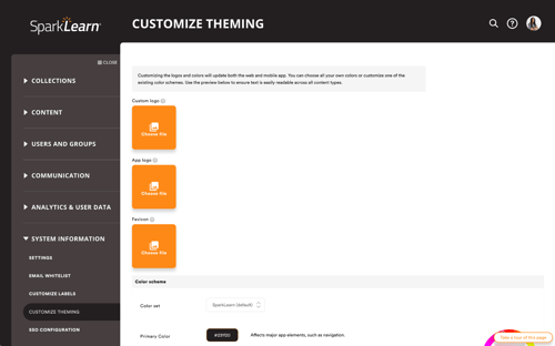
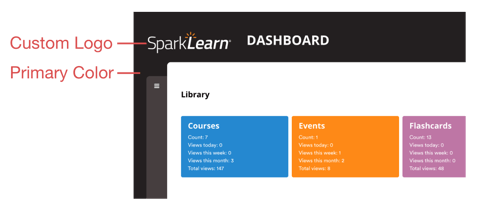
- To replace the SparkLearn logo with a Custom Logo, select Choose File.
- Recommended file size/type: 400x400px / png, jpeg, jpg, jpe, gif, or webp
- Your logo should be easily visible against the color you set as the "Primary Color"
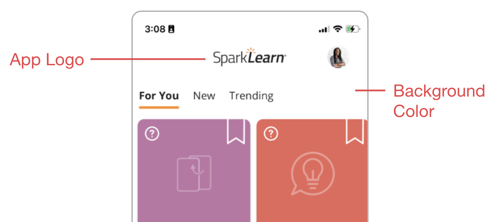
- The logo that appears in the App has a different size, and should be uploaded separately. Select Choose File to upload an App Logo.
- Recommended file size/type: 300x90px / png, jpeg, jpg, jpe, gif, or webp
- Make sure this version of the logo is easily visible against the color you set as the "Background Color"
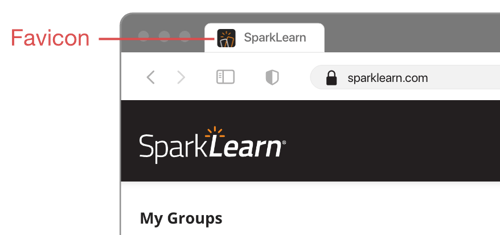
- To add a custom Favicon (the small icon shown in the address bar or when the user bookmarks the site) select Choose File
- Recommended file size/type: 300x300px / png
- The design should be simple and easy to identify at a very small size
- Use the Color set dropdown menu to choose one of the existing color schemes
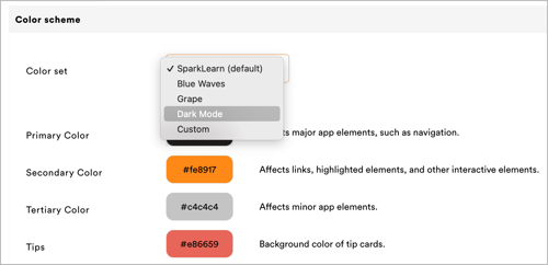
OR - Customize the color palette to your brand by using the color wheel or typing the
hex-codes into the box beside each sections you want to change
- The Primary Color is used for the log in screens, menus, and navigation.It is important that white text can be easily read against the color chosen.
- The Secondary Color is used for links, buttons, Tags and more. It is important that this color is easily visible against the Primary Color and the Background Color
- The Tertiary Color is used for navigation in the mobile app and should also be easily visible against the Primary Color and the Background Color
- Background Color (usually white) refers to the color of the screen on the desktop and mobile apps
- Text Color (usually black/dark) refers to the color of text on the desktop and mobile apps excluding text on buttons, menus, or certain types of content
- The Menu Background color is used for the background of navigation and profile menus. We recommend that it a slightly darker or lighter version of your Primary Color.
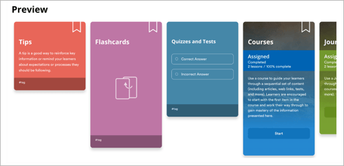
- The colors for different content types like Tips, Flashcards, Podcasts and Courses etc. should be distinct. It is also important that white text can be easily read against the colors chosen.
- Use the Preview section as you make adjustments to see how the colors you've chosen will look
- To add a Background Pattern (the pattern that appears on the login screen, the content management screens, and at the top of the learner screens) select Choose File
- Choose how the Pattern should Repeat: horizontally, vertically, or both
- Choose where to place the Anchor (where the repeating background should start)

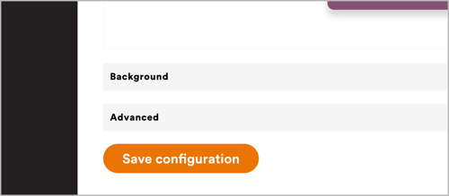
- Select Save Configuration to apply the theming customizations.
- We recommend looking through both the desktop and mobile app to review your theming and make sure things look as they should.
- We recommend looking through both the desktop and mobile app to review your theming and make sure things look as they should.
Still can't find what you're looking for? Contact Support
![sparklearn_logo_2020_large_white-01 (1).png]](https://help.sparklearn.com/hs-fs/hubfs/sparklearn_logo_2020_large_white-01%20(1).png?height=50&name=sparklearn_logo_2020_large_white-01%20(1).png)